
YOGYUI
R 산점도 행렬 그리기 본문

산점도 행렬(Scatter Plot Matrix)은 탐색적 데이터 분석(Exploratory Data Analysis, EDA) 단계에서 변수간 상관관계를 한눈에 파악하기 위해 사용하는 시각화 방법이다
R에서 산점도 행렬 시각화는 pairs 함수 1줄을 호출해 간단히 구현할 수 있다
iris 데이터의 수치형(numeric) 데이터 간 산점도 행렬을 그려보자
library(dplyr)
iris_numeric <- iris %>% select_if(function(x) any(is.numeric(x)))

pairs(iris_numeric)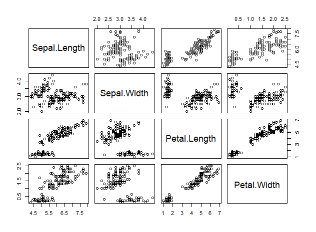
Petal.Length와 Petal.Width는 강한 양의 상관관계를 가지며, Petal.Length는 Sepal.Width를 제외한 나머지 변수들과 양의 상관관계를 갖고 있음을 한눈에 파악할 수 있다
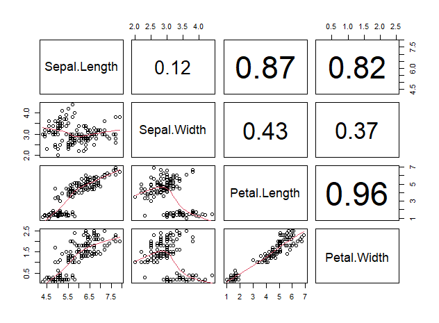
변수간 상관계수는 cor 함수로 구할 수 있다
cor(iris_numeric)
>
             Sepal.Length Sepal.Width Petal.Length Petal.Width
Sepal.Length    1.0000000  -0.1175698    0.8717538   0.8179411
Sepal.Width    -0.1175698   1.0000000   -0.4284401  -0.3661259
Petal.Length    0.8717538  -0.4284401    1.0000000   0.9628654
Petal.Width     0.8179411  -0.3661259    0.9628654   1.0000000
산점도 행렬은 대각선을 기준으로 좌하단 영역과 우상단 영역이 대칭 구조이기 때문에 우상단은 다음과 같이 상관계수로 대체하는 것이 일반적이다
panel.cor <- function(x, y, digits=2, prefix="", cex.cor, ...) {
    usr <- par("usr")
    on.exit(par(usr))
    par(usr = c(0, 1, 0, 1))
    r <- abs(cor(x, y, use="complete.obs"))
    txt <- format(c(r, 0.123456789), digits=digits)[1]
    txt <- paste(prefix, txt, sep="")
    if(missing(cex.cor)) cex.cor <- 0.8/strwidth(txt)
    text(0.5, 0.5, txt, cex = cex.cor * (1 + r) / 2)
}

pairs(iris_numeric,
      lower.panel = panel.smooth,
      upper.panel = panel.cor)
좀 더 고급 시각화를 하고자 할 경우, 대각선에 변수의 히스토그램을 그려 정규분포 여부까지 한눈에 알 수 있도록 한다
panel.hist <- function(x, ...) {
    usr <- par("usr")
    on.exit(par(usr))
    par(usr = c(usr[1:2], 0, 1.5) )
    h <- hist(x, plot = FALSE)
    breaks <- h$breaks
    nB <- length(breaks)
    y <- h$counts
    y <- y/max(y)
    rect(breaks[-nB], 0, breaks[-1], y, col="white", ...)
}

pairs(iris_numeric,
      lower.panel = panel.smooth,
      upper.panel = panel.cor,
      diag.panel = panel.hist)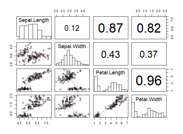
Sepal.Width는 정규분포를 보이는 것을 알 수 있다
panel.cor 함수와 panel.hist 함수는 pairs 함수에서 기본으로 제공하지 않아 사용자가 커스터마이즈해야 하는 함수로, example(pairs)에서 확인 가능한 여러 예시 중 일부에 기재되어 있다
개인 쿡북에 저장해두고 필요할 때마다 복붙해서 사용해도 되는데, 어쨌든 함수를 직접 구현해야 하기에 번거로운 단점이 있다
위의 시각화 과정을 한번에 해결해주는 패키지들이 있어 소개해보도록 한다
1. psych
# install.packages("psych")
library(psych)
psych::pairs.panels(iris_numeric)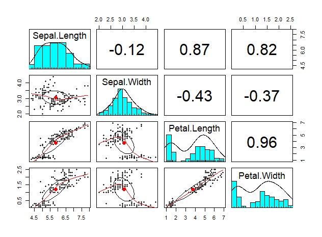
똑같은 형태의 플롯을 히스토그램에 색깔까지 넣어준다
2. PerformanceAnalytics
# install.packages("PerformanceAnalytics")
library(PerformanceAnalytics)
PerformanceAnalytics::chart.Correlation(iris_numeric)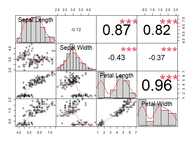
significant indicator를 빨간색 별표로 표기해준다
3. corrplot
# install.packages("corrplot")
library(corrplot)
corrplot::corrplot(cor(iris_numeric), type="upper", order="hclust")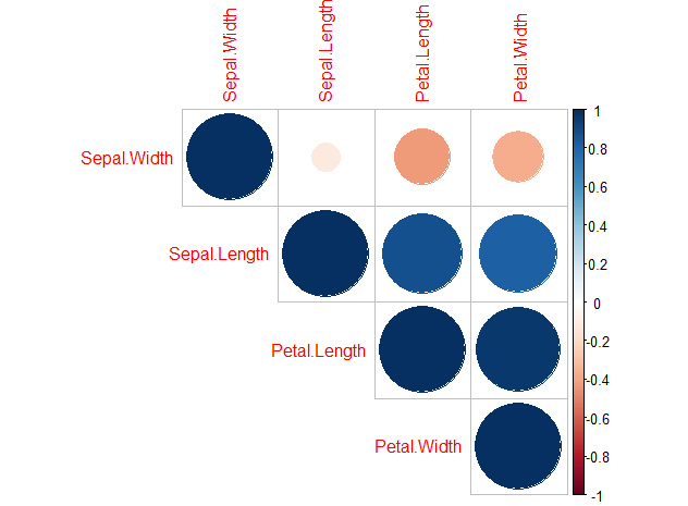
상관계수에 따라 색과 원의 크기를 다르게 표기해준다
이 외에도 corrgram 등 다양한 패키지가 존재하니, 본인 입맛에 가장 잘 맞는 것을 골라서 사용하면 될 것 같다
[참고]
https://stackoverflow.com/questions/5446426/calculate-correlation-for-more-than-two-variables
https://m.blog.naver.com/PostView.naver?isHttpsRedirect=true&blogId=edgelab&logNo=150187105234
권재명, 『실리콘밸리 데이터과학자가 알려주는 따라하며 배우는 데이터 과학』, 제이펍(2017), p242.
'Software > R' 카테고리의 다른 글
| R boxplot 함수로 이상치(outlier) 감지하기 (0) | 2021.06.18 |
|---|---|
| R caret::varImp - 변수중요도 측정 (0) | 2021.06.18 |
| R caret::confusionMatrix - 혼동행렬 작성 및 metric 추출 (2) | 2021.06.17 |
| R caret::preProcess - 수치형 데이터 정규화, 표준화 (0) | 2021.06.17 |
| R 회귀분석 모델 성능판단 - RMSE, MAE, R squared (0) | 2021.06.16 |


